Pride Buffalo’s 2005 celebration marked an important moment for LGBTQ visibility in Western New York. The annual parade and festival brought together community members, activists, families, and allies for a week of events across Allentown and Elmwood Village. For that year’s theme, “True Colors,” the organization needed a cohesive visual identity and a set of promotional materials that reflected the energy, resilience, and diversity of Buffalo’s LGBTQ community.
The Challenge
Promoting a Pride event in Buffalo in 2005 required more than colorful graphics—it required cultural sensitivity, local understanding, and the ability to capture a community in transition. Nationally, LGBTQ issues were at the center of intense debate. Only a handful of places had marriage equality; many U.S. states, including parts of the region, were passing marriage bans. Locally, Buffalo’s LGBTQ community remained vibrant but deeply grassroots, centered around Allentown’s bars, artists, nonprofits, and the Pride Center of WNY.
Pride events in Western New York were growing, but they still relied heavily on volunteers, nonprofits, and local businesses to bring the celebration to life. Visibility was crucial. Community organizations were advocating for equality, expanding HIV/AIDS services, and providing support for LGBTQ youth. Pride needed materials that weren’t just functional—they needed to energize, unify, and celebrate a community that was working hard to be seen.
Without today’s digital amplification, print materials carried tremendous weight. Posters in storefront windows, ads in alternative newspapers, and the beloved Pride Guide were how the community discovered events, learned about performers, and marked the festival as their own. The challenge was to create a visual identity that stood out across the city and made Pride Week feel cohesive, joyful, and unmistakably Buffalo.
The Solution
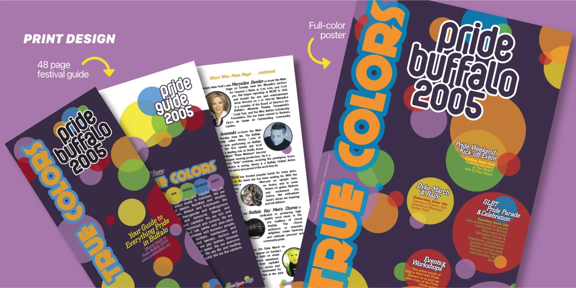
The “True Colors” branding leaned into the six hues of the rainbow flag, expressed through a playful colored bubble motif that could shift and expand across different applications. The identity was bright, modular, and instantly recognizable, giving Pride 2005 a distinctive look that carried across all campaign touchpoints.
A complete logotype and visual system were developed for the event, then extended into the layout of the 48-page Pride Guide. This guide served dual purposes: a promotional piece distributed citywide in advance of the celebration, and an essential companion for attendees on the day of the parade and festival. The bubble motif threaded through the publication’s sections, creating rhythm, movement, and visual delight throughout the spreads.
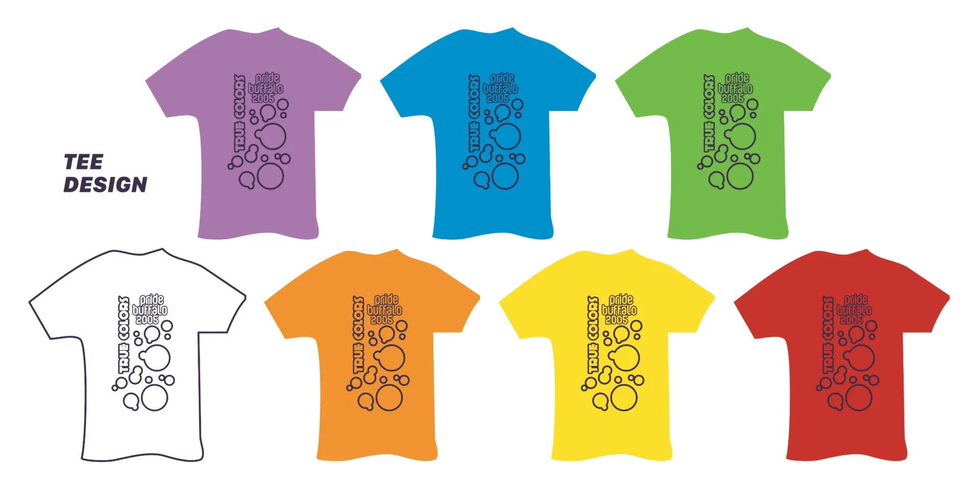
The print campaign included a full-color poster displayed throughout Buffalo, along with a separate poster for Fabulous: The Party, a signature Pride Weekend event. Additional collateral included newspaper ads placed in local publications and a series of T-shirt designs featuring the Pride Buffalo 2005 logo. To keep production costs accessible for the organization, the shirts were printed in a single color across seven different shirt colors—six in rainbow hues and one in white—creating variety without added expense.
Community partnerships helped amplify the campaign further. Existing relationships with The TRALF and Buffalo Current, an alternative newspaper, enabled additional visibility and sponsorship support. This project is one of many collaborations with nonprofit organizations over the years, where thoughtful design and community connection worked hand-in-hand to elevate local voices.